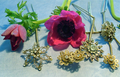
The contrast between the anemones and the ground are more successful than the peony.
My name is Alice Colson and I am in my 3rd year studying embroidery at Manchester Metropolitan University. This is a journal of my reflections and progress through the year.
Thursday, 29 March 2012
Sunday, 25 March 2012
Studio Presentations with Mary Stark - Reading my work
I've been making edges in my work from the first black and white drawing,
how did I miss it for so long?!! I'm finally getting what it means to read my work.
- Pin / photograph my samples on a manikin.
- Consider stitching onto a printed surface.
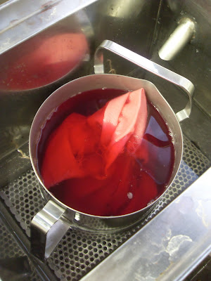
Jenny Wilson has developed a clear idea about creating collections of samples and has sourced some beautiful fabrics from London. Although my dying has been successful I would like some pre-dyed fabrics to work on as
I find the dying process unpredictable and slow.
I find the dying process unpredictable and slow.
 |
 |
| Fashion fabric samples by Jenny who takes her inspiration from natural forms |
Wednesday, 21 March 2012
Tulips
I was hoping the frilliness of my tulip drawing would translate well into cut stitch especially as the petal stitches are horizontal like the original trim I made. It seems to have lost the fluidity of the drawing.
I noticed that parrott tulips also feature in the trends for 12/13.
- Try without gold thread on a coloured, neutral ground.
Tuesday, 20 March 2012
Using a bright colour palette
I like the effect of the alternate cut lines and the colours but they don't work as well as Tricia Guild or Mary Katrantzou's palettes which have more neutral contrasts.
- Use less metallics and contrast with neutral grounds.
Friday, 16 March 2012
Matthew Williamson in Conversation with Colin McDowell
Tuesday, 13 March 2012
Breakthrough!
 |
| Satin lines on the bias, a joyful combination of blue, lime green and red, which I'm really pleased with! I'm planning to try a rouleaux effect so that the backing fabric can't be seen. |
 |
| The gold makes the red more vibrant, which works well. |
 |
- Focus on satin, obi and piping stitch working on a large scale initially, avoid flat fill stitch.
- Develop designs for flowers using Horrockses dresses for reference.
- Use motifs at different scales and colour palettes to create new designs.
- Lines - rouleaux
Saturday, 10 March 2012
more layered circles
Thursday, 8 March 2012
Manchester Antique Textile Fair
I went hoping to find a colour palette and shapes for my trims,
when I put the various items together that I'd bought, it seems I have!
I stewarded for an hour on the door.
Wednesday, 7 March 2012
Satin stitch lines
Tuesday, 6 March 2012
Thursday, 1 March 2012
Seamless Garments - Annie Shaw
Annie's seamless, knitted gansey reminded me of Miyake's A-POC seamless, woven garments. I've also come across a seamless stent for medial use made from embroidery on dissolvable fabric, which is apparently more flexible that knit or weave and wonder if there is an application of it in fashion yet.
Subscribe to:
Comments (Atom)


