Showing posts with label colour. Show all posts

Friday, 11 May 2012

Global Threads

 Although Anne Wilson's piece is full of colour I thought the black lines between them interrupted the flow. I preferred the white on white tones and beautiful layering of the cotton wedding dress.


Friday, 20 April 2012

"What can you do with a bit of black flannel?"

I am very happy with this latest sample, it's the first one I've made that immediately says fashion rather than interiors! I love the jewel like quality of the revealed stitches, 
which also fits with my original desire to reveal something of the unseen realm.

What I'm about at last seems to be coming out into the open, I'm a fabric maker.
  • Focus more on the ground colour, use neutrals and muddy colours to contrast with brights.


Wednesday, 18 April 2012

Trimmings

I'm still struggling with my colour palette because I'm using the fabrics I dyed at first.
  • Re-dye fabrics to knock back the colours for neutral tones. 


Sunday, 8 April 2012

Trimmings from satin lines

twin needle line in between

This trim has some potential, though the colours and tassel effect 
give more of an interior than a fashion feel at this stage.

Thursday, 29 March 2012

Bright colours on neutral ground

The contrast between the anemones and the ground are more successful than the peony.


Tuesday, 20 March 2012

Using a bright colour palette

I like the effect of the alternate cut lines and the colours but they don't work as well as Tricia Guild or Mary Katrantzou's palettes which have more neutral contrasts.
  • Use less metallics and contrast with neutral grounds.


Monday, 27 February 2012

Matthew Collings and Emma Biggs - Lecture

She is a mosaicist and chooses the colours instinctively, which he then paints! Each side of the diamond is two tones of one colour. The colours draw your eye across the surface creating a visual vibration or pulse. 
I'd like to create this effect with the colours in my circles.


Sunday, 19 February 2012

Looking for a colour palette in the edges of heaven and earth

The colours as the sun sets are beautifully bright and muted 
but I'd prefer to work with a broader colour palette.


Wednesday, 15 February 2012

More satin stitch circles

Experimenting with different ways of cutting the satin stitch, continuing with the circle motif for now.

Thursday, 9 February 2012

Drawing with Colour from Different Views

The painting below is the beginning of a response to Nigel's suggestion 
to use more colour and to draw from different perspectives.

Basket of soap - gouache and graphite

Friday, 3 February 2012

Circles and Layers

Creating 3D effects is important to me, so I am considering layers and repeats as illustrated below. Gornall's combination of precise lines and organdie circles in brilliant colours across layered planes are very compelling. Harries' layered alphabets have a more simple, rustic look but again have depth.

Short Walk VIII (detail) Rachel Gornall
Embroidery May / June 2011 p.40
Slate Alphabets (detail) 2009 Ruth Harries
Embroidery November / December 2011 p.30


Thursday, 2 February 2012

Looking for edges

I feel I have to get in charge of the multi head which at the moment feels as if it dictates the terms.  I wanted to draw with it but the colours, the fabric and the scale don't work, I think it's better to pursue the satin stitch technique for now.
Asta Barrington's work gives me a sense of how my work could develop.

Scarf by Asta Barrington
Winter jasmine


Wednesday, 1 February 2012

Tutorial with Nigel

Looking over sketchbooks and technical files from previous years Nigel focused on my drawing ability, which was encouraging. He picked out a photo of lipsticks I'd taken, 
pointing out the colour palette using a flash of mauve amongst the dark tones. 


  • Develop drawing using colour and tone.
  • Draw from different viewpoints rather than just straight ahead.

Tuesday, 13 December 2011

Materials Review


My materials review was an important turning point for me in recognising
the importance of using more colour in my work. Words to describe my materials were
textured, sculptural, folded, detailed, bright and embellished. 

  • Research fashion designers who use bright colours and technology.

Wednesday, 30 November 2011

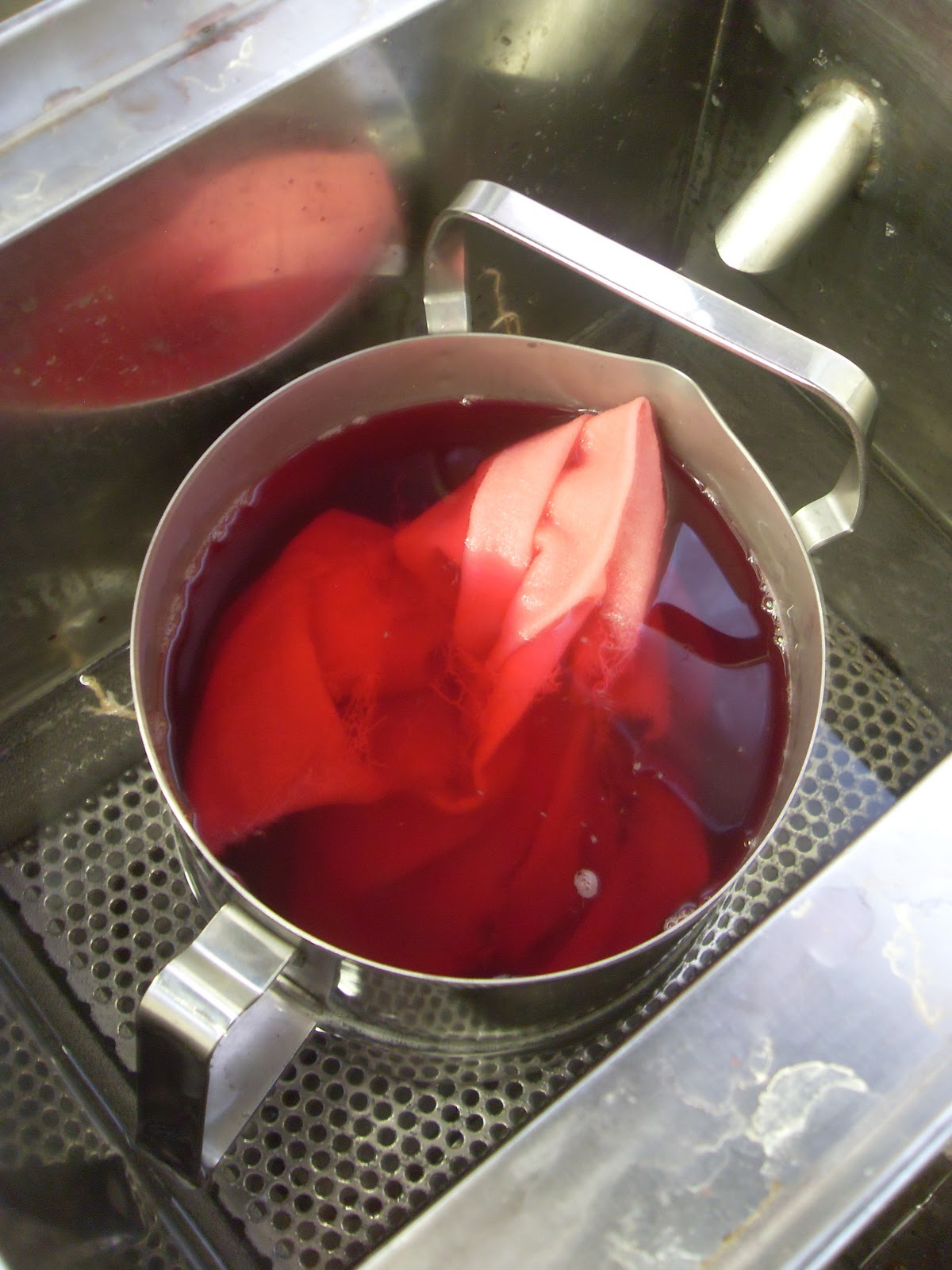
Dye Lab Induction

I may want to dye my own fabrics for the garments I make.


Burn tests to identify fibres above, viscose below, to decide appropriate dyestuff and method.
 Washing cloth after weighing it, before dying.
Weighing dyestuff in the laminar flow extraction booth to prevent inhalation.

Thursday, 27 October 2011

Collaborative Projects Lecture

I was amazed at the jewel like colours of the suffolk puff quilt 
that Lynn Setterington had made from plastic carrier bags for Stitching up Oxford Road.  
The distorted images of the bags remind me of Japanese fabrics.